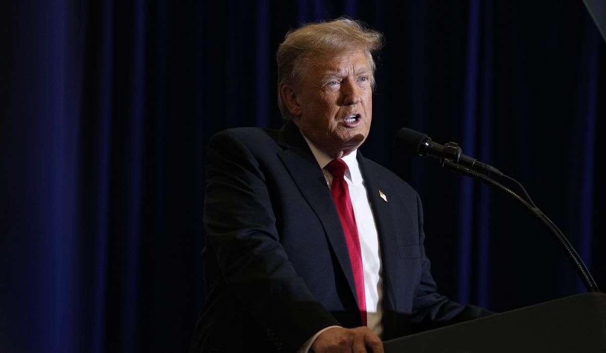
Trump has a new metric by which he wants to evaluate the pandemic. Please update your records.

Certainly sobering and objectively bad news. But it’s hard not to notice that this is not the metric that Trump has used in the past to evaluate the pandemic. It’s hard not to notice that the goal posts are moving around a lot here, depending on the case Trump wants to make.
After all, it was about a month ago that we were being told that the most important metric by which to evaluate how the country was faring in its battle against the virus was the number of deaths relative to cases. This, Trump and his team assured us, was the important thing. That there were so few deaths relative to the number of new cases proved that the government’s approach to the pandemic was working.
That assertion was obviously opportunistic, though — and cynically so. It was a function in part of improvements in treatment and in who was contracting the virus, but it was also a function of the fact that new cases had surged while deaths resulting from those new infections had not yet manifested. People who had contracted covid-19, the disease caused by the virus, were fading, but before they died, the White House saw an opportunity to score political points.
In recent weeks, as the number of new cases has (happily) dropped and after the number of deaths increased, that rate has again risen. And the White House isn’t really talking about it anymore.
Instead, Trump is now again talking about new cases, something that he has repeatedly told us is simply a function of testing. Why? Because cases are, in fact, declining again in the United States.
But even now, Trump’s presentation is misleading. Instead of talking about raw increases or increases as a function of population, he talks about percentage-point increases. Why? Because a 50 percent jump in new cases could be a country going from 10,000 a day to 15,000 a day — or it could be an increase from 10 to 15.
In the examples he cited, the increases were usually much closer to that second example. New cases are declining in the United States more than in other countries, but we’re still adding new cases between two and 19 times as quickly when adjusted for population. If we don’t adjust for population, we’re adding new cases at a rate six times all the countries Trump mentioned combined.
|
Weekly change |
Seven-day average |
Cases per million |
Death rate |
|
|---|---|---|---|---|
|
United States |
||||
|
United Kingdom |
||||
|
Netherlands |
||||
|
Switzerland |
Oh, and the rate of deaths relative to new cases is higher in the United States than most other countries, too.
(You’ll notice that our percentages don’t match Trump’s. It’s not clear what data he is using; ours are from Johns Hopkins University. That 113 percent increase in Spain appears to be from late July, so it’s possible he’s just using outdated numbers. Nonetheless, the point remains.)
What Trump’s cherry-picked data don’t convey (intentionally, of course) is the extent to which the United States is an outlier in the pandemic. For example, we are home to a bit more than 4 percent of the world’s population — but we’ve seen more than a quarter of the recorded coronavirus cases.
There are two big caveats to that point. The first is that we are, in fact, conducting more tests than other countries (like Mexico), meaning that we’re confirming more existent cases than other countries. That doesn’t conflict with the reality that the virus has spread unchecked here, of course, but it does mean that other countries are probably underrepresented on the graph above. The other caveat is related: We can’t be confident that all countries (looking at you, China) are accurately reporting data.
Nonetheless, the United States is an outlier. It’s an outlier on deaths, too, with more than 22 percent of the confirmed deaths globally.
Countries below the diagonal dotted line on these graphs are ones that make up more of the confirmed deaths than they do the world’s population — and are therefore seeing disproportionately high effects from the pandemic. We have colored the countries Trump mentioned in orange. Here, you can see that several of those countries fall below the diagonal line, often a function of their seeing surges in new cases early in the pandemic when contracting the virus was more likely to be fatal.
Looking only at recent cases, the United States still fares poorly. India makes up a higher percentage of recent cases, but, then, it’s far more populous than the United States.
You’ll notice that several Central and South American countries appear as disproportionately affected on the graphs above. That’s true when considering recent deaths, as well.
Trump did mention those countries during Tuesday’s briefing, noting that the region had completed far fewer tests than the United States. In the past, he has been more pointed about comparing the pandemic in the United States to its progression there, but, of course, the global expectation is that the United States will respond to situations like this one in a manner more similar to Germany and France than to Peru and Argentina.
So he laid out some percentages from those European countries on Tuesday, then tacked on a promise.
“In our country, [new cases] are going down,” he said. “We will be seeing that even more rapidly as time goes by — a short time.”
If not, look for a new metric to become the focal point of the White House’s attention.