A powerful argument for wearing a mask, in visual form
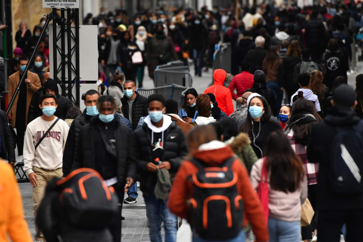
For all 50 states plus D.C., this chart plots the percentage of state residents who say they wear a mask in public all or most of the time (on the horizontal axis) and the percentage who say they know someone in their community with virus symptoms (on the vertical axis).
Take Wyoming and South Dakota, for instance, in the upper left-hand corner of the chart. Roughly 60 to 70 percent of state residents report frequent mask use, as shown on the bottom axis, which puts them at the bottom for mask rates. They also have some of the highest levels of observed covid-19 symptoms, approaching 40 and 50 percent.
Now, note what happens as you move across the chart. States farther to the right have higher rates of mask use. And as mask use increases, the frequency of observed covid-19 symptoms decreases: More masks, less covid-19.
Let’s pause a minute to talk about where exactly this data comes from. Ideally you would want it to be from something like a random-digit-dial survey, the type typically used in public opinion polling, which with enough participants would produce a sample of each state that’s representative of its population and demographics. But the cost of running one such survey for all 50 states plus D.C. would be enormously prohibitive — to say nothing of doing so on a daily basis, which is necessary to produce the kind of real-time data of interest to epidemiologists.
“If Facebook’s users are different from the U.S. population generally in a way that the survey weighting process doesn’t account for, then our estimates could be biased,” cautioned Alex Reinhart, a Carnegie Mellon professor of statistics and data science who works on CovidCast and wrote a book on statistical methods. “But if that bias doesn’t change much over time, then we can still use the survey to detect trends and changes.”
He also cautioned that the old saw of “correlation doesn’t equal causation” applies here as well.
“There could be other explanations for the correlation,” he said. “For example, states that had worse outbreaks earlier in the pandemic both have higher mask usage now and more immunity.”
And, he added, “if people say they’re not wearing masks, they may not be taking other protective measures either. So perhaps what we see is a combination of mask usage, other social distancing behaviors and perhaps other factors we haven’t measured.”
Nevertheless, the chart is particularly useful in the context of all the other high-quality evidence showing that masks reduce the transmission of the coronavirus and other respiratory diseases. There’s good reason to suspect, in other words, that rates of mask use are driving at least part of the relationship seen in the chart above, even if the data can’t prove that definitively.
For people living in states that are driving the latest spike in coronavirus cases, the takeaway is clear: Wear a mask when you go out in public.