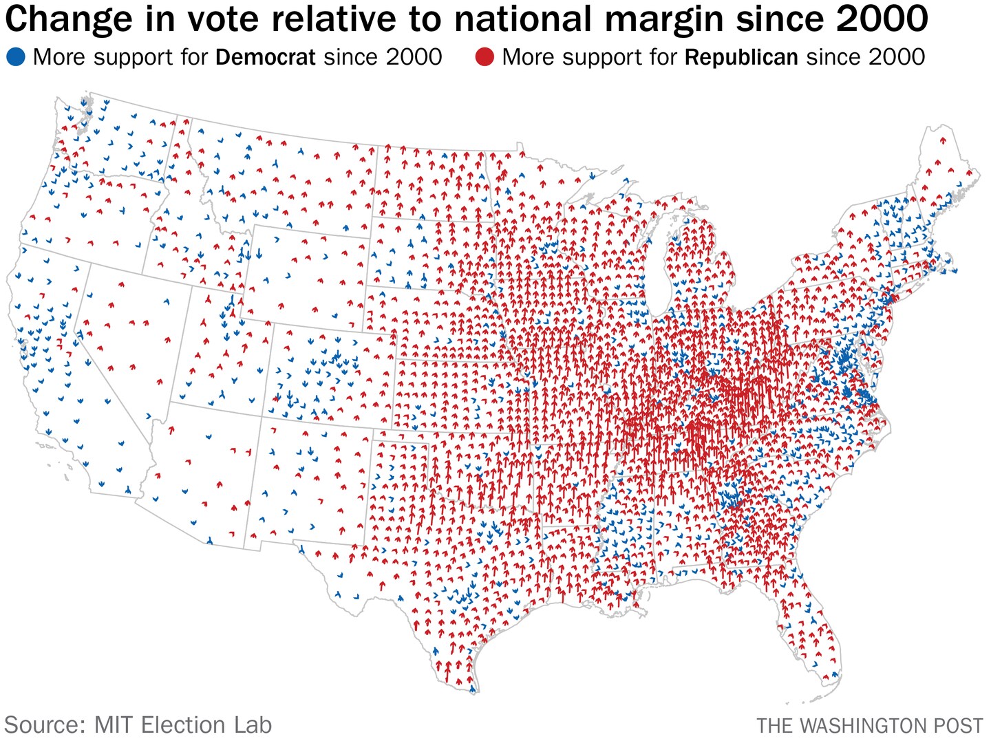
What the political shift in rural counties looks like since 2000
The sociological exploration aside, it’s useful to understand what that political shift looks like. It is the case that rural areas have grown more densely Republican even over the past two decades and, in fact, that this shift has happened quickly enough that it helps offset the decline in rural population that’s happening at the same time.
“Republicans’ plight as the rural party of a increasingly non-rural nation has so far been balanced out by the fact that rural America has moved toward the GOP at a faster pace since the 1990s than urban America has shifted away,” political scientist David Hopkins wrote last year. “When combined with the structural biases of the electoral college and Senate in favor of rural voters, the current Republican popular coalition can easily remain fully competitive in national elections.”
The data reinforces that point. From 2000 to 2020 — and particularly in the last two, Trump-inflected elections — rural counties shifted to the right more than urban counties moved to the left. That’s helped rural areas add votes on net even as they trail urban counties in terms of population. On the graph at right below, you can see the net vote totals from each type of county. That the Democrat earned far more votes in 2016 than the Republican was offset by the Republican’s votes coming in rural areas that cumulatively hold disproportionate power in the electoral college.
I was curious what that shift looked like geographically. So, using data from MIT Election Lab, I created a map showing the shifts by county since 2000. Red arrows indicate counties that voted more Republican relative to the national margin than they had in 2000. Blue arrows voted more heavily Democratic. Each arrow tracks the extent of that shift, with longer arrows indicating a bigger shift.
(If you view the maps in a larger size, you can see the movement election over election. The start of each arrow is the zero value at 2000; it then follows each of the next five elections with arrows moving up moving to the Republican candidate relative to the national vote and arrows heading down moving to the Democrat.)
There’s an obvious cluster in the lower Midwest/Appalachia that we’ll come back to. But first we should note that map looks far more red because we’re weighting all of the counties equally. If we give urban areas bigger arrows, we get a better sense of how the country has changed, to Hopkins’s point.
But the point is the scale of the shifts. Let’s pick out each kind of county.
Here are large urban counties. These are small arrows; the shifts to the Democrats (that didn’t occur in New York City, Buffalo and Detroit) were relatively modest. In part that’s because of the change shown from 2016 to 2020 on the graphs above. Trump did better in urban areas in the most recent election than he had four years prior, undercutting his claims about massive fraud in those places.
Smaller cities generally shifted to vote more Republican, though there’s some regionality at play here. In the west, for example, the shift was to the Democrats, though not dramatically. (Again, the color only shows 2000 vs. 2020. View the maps large to see changes between those elections.)
While suburban areas were important to Biden’s win in 2020, they have often shifted to the right since 2000. That the Democrats did so well in 2018 was in part a function of clawing back gains in those counties.
And then there are the rural counties. Again, there are regional differences: the Northeast moved a bit to the Democrats, as was the case in Colorado. But then there’s that area in the southern Appalachian region.
Zooming in to Kentucky, the change is obvious. Some urban and suburban areas (as around Cincinnati) started voting more Democratic, sometimes by quite a bit. But otherwise the region moved hard to the Republicans — more than even other rural areas.
The Politico story centered on Dubois, Pa., a town to the northeast of Pittsburgh. In 2000, it preferred George W. Bush by about 21 points. In 2020, it preferred Trump by 50.
That’s not entirely because of migration. It’s in part because the community itself has changed.