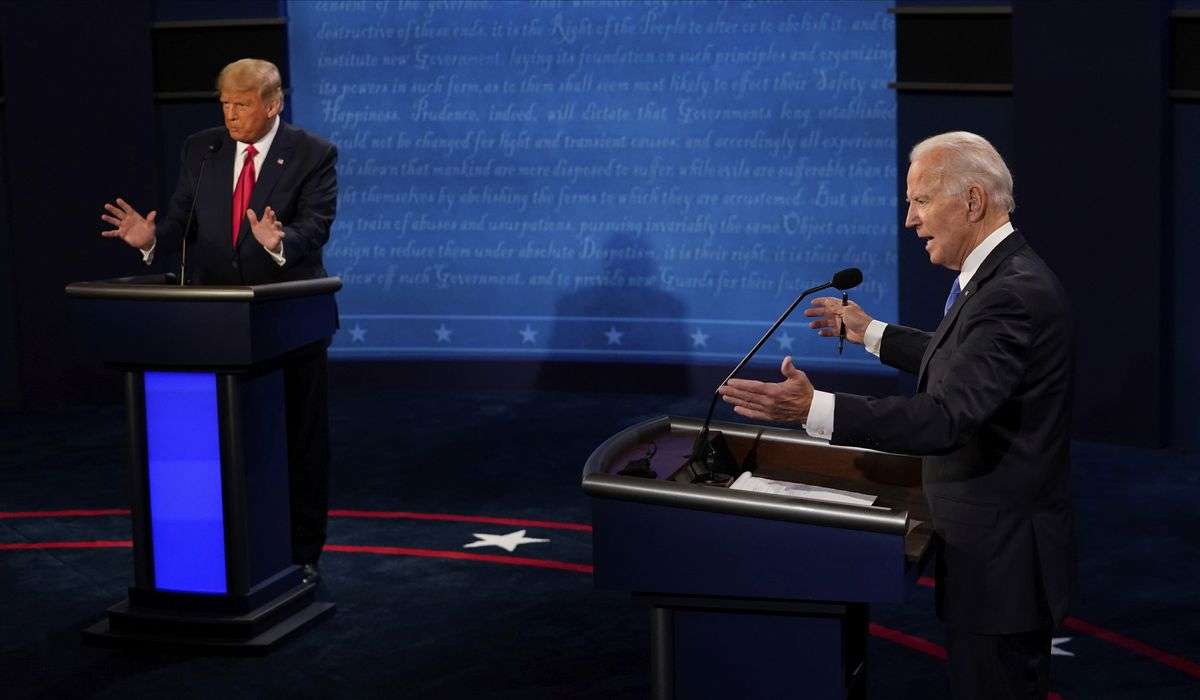
There is a middle ground between “polls are useless” and “polls will tell us exactly what will happen in an election.” As it happens, most pollsters sit in that middle ground, recognizing both that polls have utility and that using them to figure out who’s going to win a close race is generally a fool’s errand.
The perils of cherry-picking polling, illustrated
Yet it’s hard to resist the allure of a new poll. It seems so concrete! So-and-so is up 4 points in Whatever State! Sure, there’s something about margins of error tucked at the bottom of the articles about the poll, but having a concrete margin to consider satisfies our well-cultivated thirst for having some quantitative understanding of who’s winning a race. To some extent, polls fill the space in the weeks before an election in the same way that returns do on election night; they give us a way to talk about what’s happening in the period before we actually really know.
Polls, though, are more useful. The trick is to not focus on individual polls as though they are comparable and indicate movement. News outlets that tout one candidate being up by 3 points in a poll on Monday and the other candidate up by 2 in another poll on Tuesday are doing their readers a disservice, however useful for getting people to click.
To understand what’s happening in a race, it’s useful to adhere to two simple guidelines:
- More polls are better than fewer polls, and
- Polling averages are better than individual polls
We can illustrate this fairly easily.
Imagine an election in which we track a candidate’s support over the last 10 weeks of a campaign. Behind the scenes, as you’re reading, your device has generated both beginning and ending margins of support for this candidate and dozens of polls tracking the candidate’s position over time.
For the sake of ease-of-use, each of those polls has a margin of error of +/- 4.5 points. Some (indicated in purple) are from pollsters allied with the candidate and may therefore overstate support. Some (indicated in orange) are from pollsters allied with the opponent.
Let’s begin by evaluating just a handful of the polls. Watch as they’re added to the graph below.
Infrequent polls for ten weeks
Consider not only where they are — above the middle horizontal line means the candidate has a lead, for example. But also consider how they unfold. What you’re seeing is randomly generated, but there is probably a one-two set of polls in which there’s sharp movement. Imagine how that might be covered: The candidate’s support has crumbled/surged! We have a whole new race on our hands.
If we apply a polling average (here, no more complex than one that averages any polls in the prior 10 days), things are smoothed out a bit. But since we have so few polls, things might still be a bit vague.
Polling average of infrequent polls
Now let’s look at all of the polls generated in the background. What’s shown below is not really representative of any race besides maybe a presidential contest. There simply aren’t dozens of polls like this in a statewide or House contest. But, you know. This is an experiment!
Frequent polls for ten weeks
You should have a better sense here of how the actual election is going. But perhaps not! And, again, consider how the surfeit of polls allows for cherry-picking: there are enough polls that you can simply elevate the ones you want to tell your desired story. (Campaigns do this all the time.)
Finally, let’s overlay a polling average.
Polling average of frequent polls
What’s important about that average is how it smooths out the outliers. This is the point, really; if you have a poll that is plus-10 and one that’s minus-2 and one that’s plus-3, the average is about plus-4 — probably closer to the actual level of support.
Even here, there may be sudden jumps up and down dependent on the emergence of new polls. How would those be reported?
Of course, it’s also important to remember that how an election looked two weeks ago isn’t how it looks now. That’s why, in the experiment, we had a starting point and an ending point. The level of support probably changed! And, with it, the poll results, which, in our idealized scenario, are tied to the actual level of support.
Now for the reveal. Here’s what the actual level of support was over the course of those 10 weeks — what an election with 100 percent turnout would have measured on any given day. If you scroll back up, you’ll see that we added this final line to the previous graphs.
The (randomly generated) scenario
Notice which graph has the most fidelity to the actual level of support. The sporadic polls might occasionally land on the line, but there are probably a lot of dots at considerable distance. The frequent-polls graph probably tracks with the actual-level line (the dark green one), but the average is probably more consistently close to the actual level of support.
If you’d like, you can click the start over button and run through the whole experiment again. Normally, a ton of polls will give you an average that’s close to the actual result. Sometimes, it won’t.
This is oversimplified, of course. For one thing, it assumes that the polls are consistently effective at measuring support, which isn’t always the case. But it reinforces that an average of more polls is more useful than individually considering isolated ones.
In other words, remember that just because two polls show that a race flipped 10 points in three days doesn’t mean it actually did. The best measure of who will win an election remains the actual election results. And, just to cover all of our bases — the complete results, not the results shown on cable television with 1 percent of precincts reporting.
Source: WP